Setting the Stage for the Future of Fitness
Branding

Brand Refresh
Setting the Stage for the Future of Fitness
A decade of growth left iFIT with a powerful legacy—but a fragmented identity. As the company evolved into a global leader in connected fitness, it needed a brand refresh that could unify its message, elevate its presentation, and reflect its mission of wellness and innovation. This case study outlines our strategic approach to modernizing the iFIT brand while preserving its roots.
Client
iFIT
Timeframe
2022
Project Type
Branding
Role
Director of Branding, Lead Designer
Brand Refresh
Overview
Over the past ten years, iFIT had seen multiple minor logo updates, but no cohesive brand system. The company had expanded into fitness, wellness, apparel, and digital content, but the brand hadn’t evolved with it. Inconsistencies were starting to dilute impact and clarity.
We set out to give iFIT a fresh, unified visual identity that could scale with its ambitious growth. The goal wasn’t reinvention—it was refinement. We aimed to preserve what users loved while modernizing the system, making it more functional and consistent across every touchpoint.


Brand Refresh
The Challenge
The iFIT brand carried valuable recognition. However, each logo tweak over the years had created fragmentation rather than cohesion. The challenge was to modernize the visual language without alienating long-time users or losing symbolic meaning.


Internal teams lacked guidance, resulting in inconsistent execution across packaging, digital, apparel, and philanthropy materials. The absence of a shared system led to inefficiencies, confusion, and erosion of the brand.
Brand Refresh
The Solution
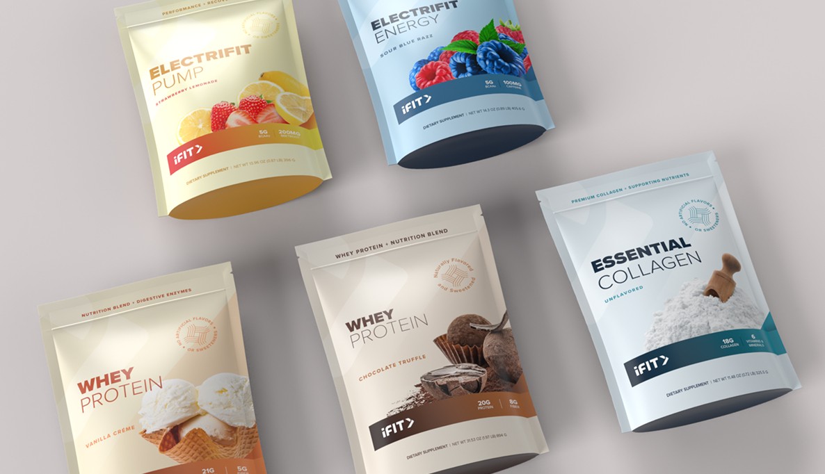
We started by honing the logo. Adjustments to the “T” improved balance and readability, while the lowercase “i” gained prominence, emphasizing inclusivity, innovation, and immersion. We paired the updated mark with a modern color palette and typography system rooted in fitness and approachability.

Identity + Branding Packaging Visual System Research + Insight

To bring it all together, we built comprehensive brand guidelines and applied them across packaging, corporate communications, and digital assets. We also extended the system to sub-brands, such as the iFIT Foundation—revitalizing the dove symbol and creating flexible branding for community events and outreach efforts.

Brand Refresh
Brand Refresh
Performance Results
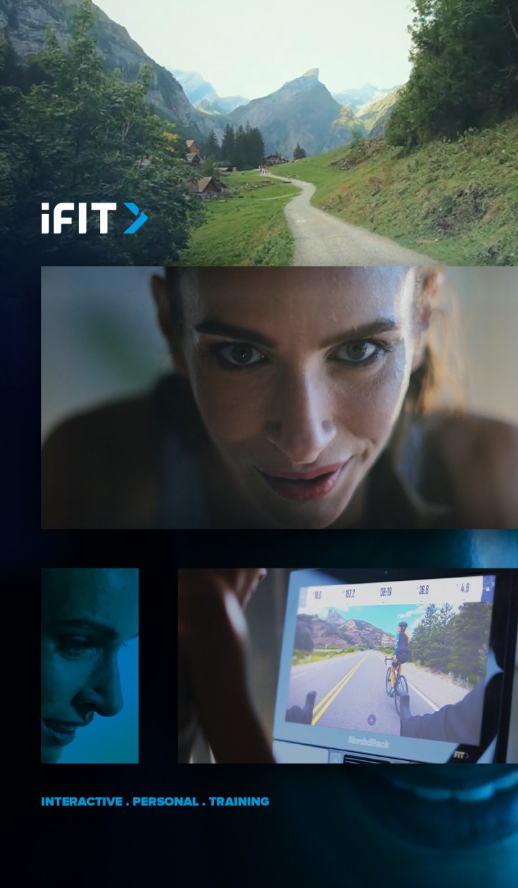
With the refreshed identity, iFIT now presents itself as the unified, innovative brand it is. Touchpoints across packaging, web, app, and apparel feel cohesive and purposeful, with consistent messaging and visuals.
Increase in internal brand consistency ratings
Updated across packaging, apparel, and digital
For creative teams using new brand guidelines
The new brand guidelines drastically reduced creative ambiguity. Teams work faster, communicate more clearly, and deliver better output. Externally, the brand presents itself as more premium, modern, and aligned with the fitness industry, while staying true to iFIT’s mission of wellness for all.