Workout Discovery to Boost Engagement and Retention
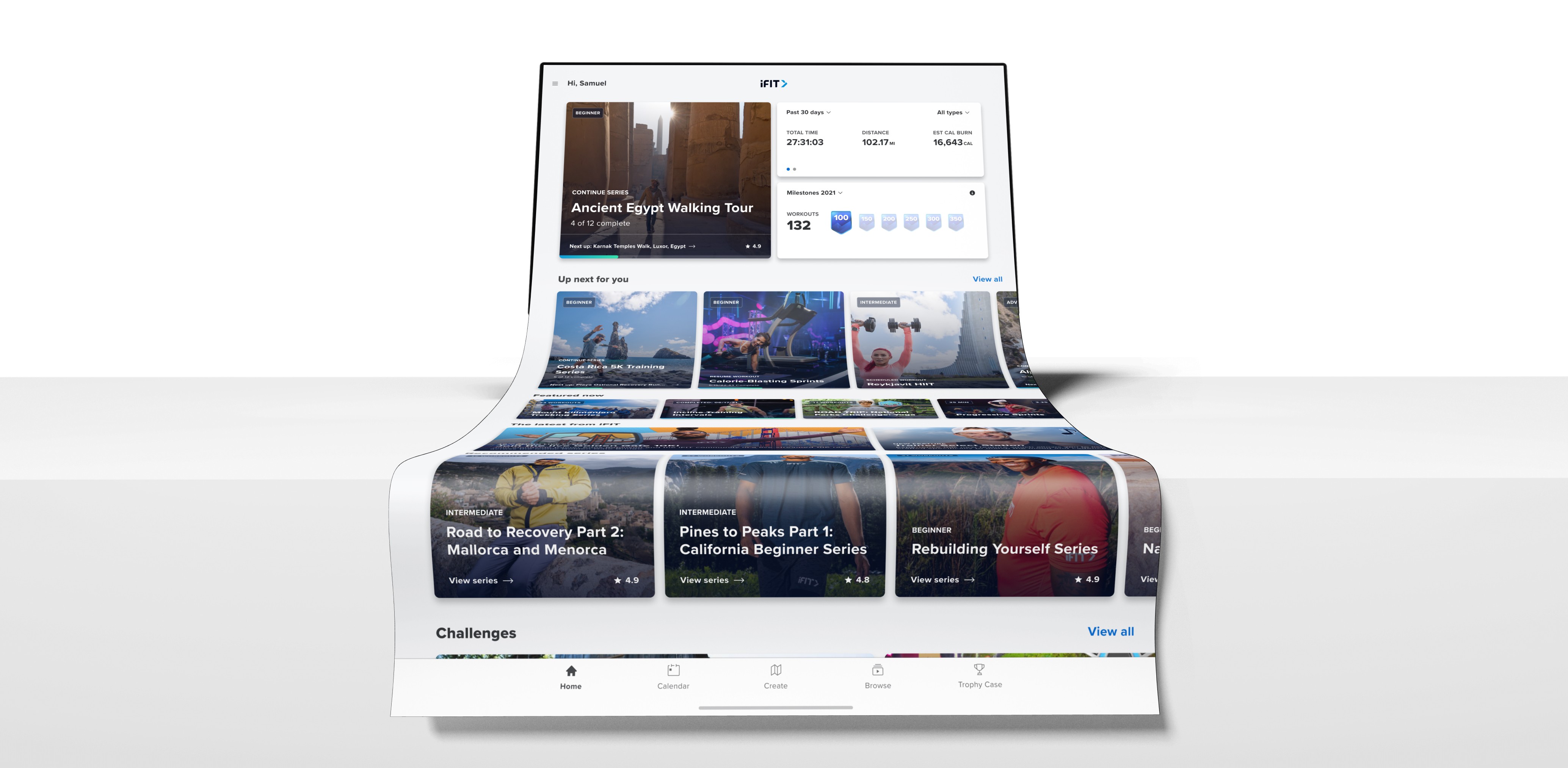
Personalized Dashboard

Dashboard Performance
Workout Discovery to Boost Engagement and Retention
iFIT empowers millions with trainer-led, immersive workouts that make fitness engaging, personalized, and achievable. But as our video library exploded to over 20,000 workouts, discovery became a friction point. Our mission: simplify the search, surface relevant workouts faster, and inspire users to hit "Start" with confidence.
Client
iFIT
Timeframe
2020-2021
Project Type
Personalized Dashboard
Role
Product Design Lead
Dashboard Performance
Overview
Since launching video-on-demand, iFIT evolved rapidly—featuring global, multi-modal content. But with success came complexity. The UX/UI was stitched together from native and web components on an aging framework, creating a fragmented experience. Users weren’t just browsing—they were overwhelmed and stalling out before pressing play.
The more users struggled to find the right workout, the more they hesitated—and the less likely they were to return. As engagement dropped, retention followed. Our job was clear: create a discovery experience that gets users moving fast, keeps them engaged, and ultimately, helps them stay consistent.

Dashboard Performance
The Challenge
Navigating a vast catalog without direction led to decision fatigue. Our data revealed a troubling trend: 65% of users reached the conversion point from their dashboard—but 12% dropped off. And many more wandered aimlessly, failing to convert at all.


The outdated backend and hybrid tech stack made rapid improvements difficult. Meanwhile, our most powerful feature—the Paramount Card—was performing well, but hidden within a sea of less effective content surfacing strategies. We needed a path forward that maximized what worked and fixed what didn’t.
Dashboard Performance
The Solution
We centered our efforts around the Paramount Card, which was responsible for 80% of all workout starts. Through user surveys, usage data, and competitive analysis, we crafted a personalized dashboard feed powered by workout trends, goals, and behavior.

Research + Insight UX/UI Product Design Design System


We reimagined the dashboard UI to bring relevant, high-impact content front and center. The new experience featured dynamic cards tailored to user goals, trending programs, and personal milestones—fueled by 2,500+ survey responses and deep behavioral insights. No more dead ends. No more decision paralysis.

Dashboard Performance
Dashboard Performance
Performance Results
Workout starts increased significantly, with users spending less time browsing and more time moving. Drop-off from the dashboard saw a measurable decline, and newly surfaced content drove a 33% lift in secondary conversions.
Via the Paramount Card
Uncovered through dashboard data
Through UI enhancements
By improving usability and making personalization actionable, we helped users build workout routines that stick. Engagement grew, and with it, retention. The Paramount Card went from a useful feature to the centerpiece of a revitalized, results-driven experience.